Booking Without the Panic: Redesigning the Train Ticket Experience
A design challenge to simplify the online train booking process by reducing user stress and decision fatigue—especially for last-minute buyers.
My Role
identifying usability issues, validating the problem with real users, and redesigning the flow with improved clarity and structure.
Durations
1 Months
Overview
This case study was created as part of a design challenge with a specific goal: to improve the user experience of booking train tickets using the KAI Access app (Indonesia’s official railway booking platform). The challenge focused on a critical pain point—the limited time users have to complete their booking, which often leads to rushed decisions and errors in selecting schedules or seats.
Rather than reimagining the entire app, the goal was to redesign key moments in the booking flow to help users make decisions with more clarity and less pressure.
Problem Statement
When booking a train ticket, users expect a simple and stress-free experience. However, that's not always the case—especially for those booking close to their departure date. After reviewing the challenge brief, here are the key problems I identified :
Users find it difficult to find a schedule that suits their wishes
Users feel rushed when paying for their ticket orders because they are afraid of running out of seats
Limited seat slots available and often running out of seat slots when ordering tickets
Validating The Problems
Although the problem was clearly described in the brief, I wanted to make sure it was also something real users experience—not just an assumption. So, I decided to validate it by talking to some of my friends who regularly book train tickets.
I asked them a few simple questions about their habits, challenges, and how they feel when booking through apps like KAI Access or Traveloka.
What I Learned from Users
From my short validation session, I found a few interesting patterns:
Users who book early (2–3 weeks before departure) usually do it to avoid running out of seats. They often use apps like Traveloka or KAI Access and don't feel rushed because they have time to plan.
Users who book closer to the departure date feel more stressed. Two of them mentioned that the limited time during booking made them feel anxious and in a hurry, which sometimes led to mistakes—like picking the wrong schedule or rushing through checkout.
On average, users spent 15–20 minutes to complete a booking. This includes comparing schedules, choosing seats, and reviewing passenger data.
In short, while some users are more prepared, the time limit during booking still creates pressure—especially for last-minute buyers. They want to be sure of their choices, but the app design doesn't fully support that calm decision-making process.
Design Approach
To address the challenges faced by users when booking train tickets under time pressure, I followed a structured design approach that focuses on simplifying the flow, reducing anxiety, and giving users more control over their decisions. Here’s the approach I took:
Understanding the Problem
The first step was to clearly define the problem based on both the brief and my validation with real users. Users were stressed by the limited time to make a booking, especially when booking close to the departure date. This created a rushed experience and led to mistakes such as selecting the wrong schedule or seat.
Settings Design Goals
Based on the findings, I outlined key design goals:
Reduce booking pressure by offering users more time to make decisions.
Provide users with clear guidance throughout the booking flow.
Make the process feel more calm and less stressful, while respecting the constraints of seat locking and time limits.
Ensure user control over the booking process without feeling rushed.
Ideation & Feature Brainstorming
I explored several potential solutions that could help address these goals, including:
Temporary Reservation Feature: Allow users to reserve seats for a limited time, giving them the flexibility to review their choices without the pressure of the timer.
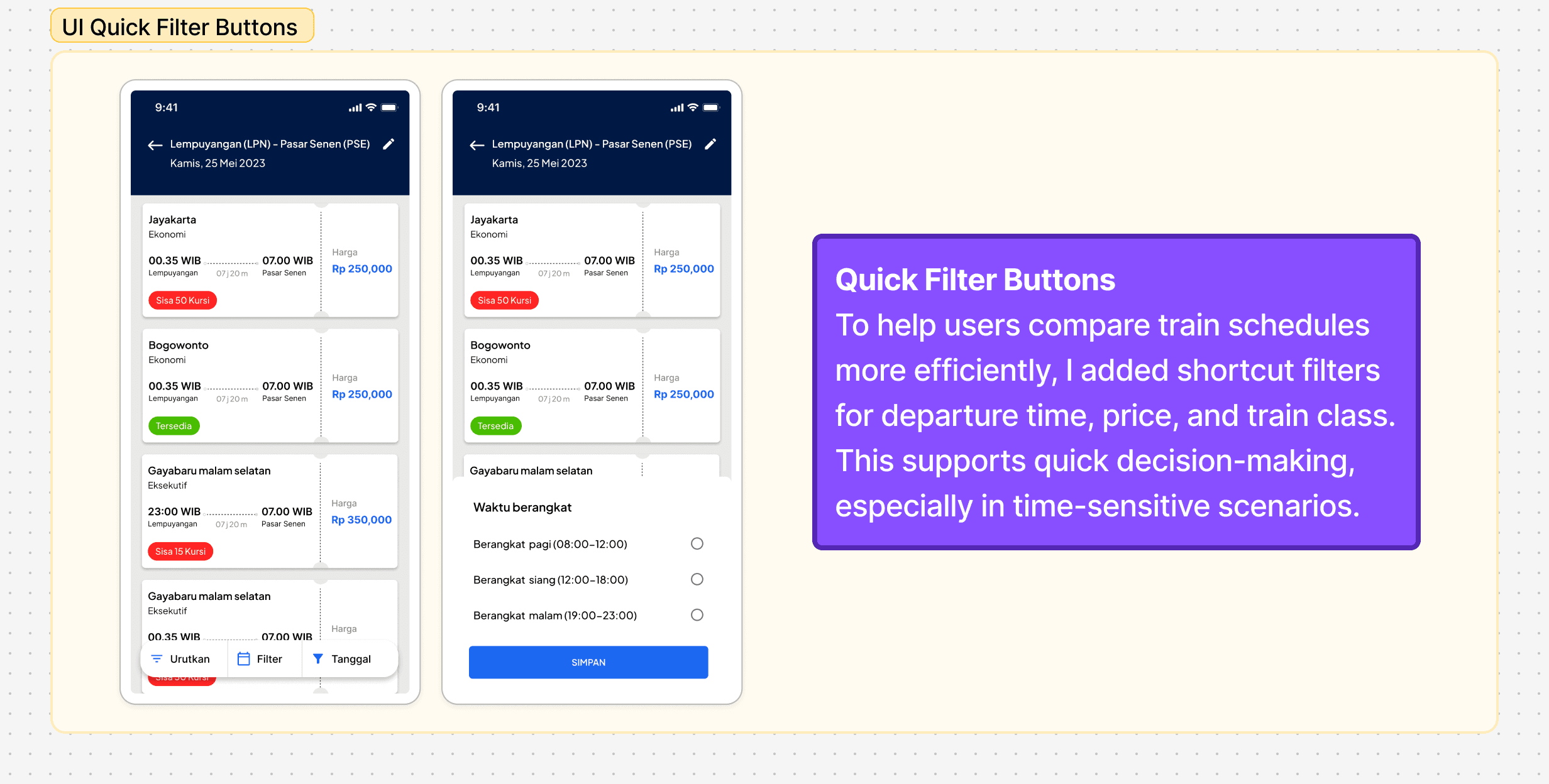
Quick Schedule & Seat Search: A filter button that allows users to quickly search for available seats, reducing the time spent navigating through unnecessary screens.
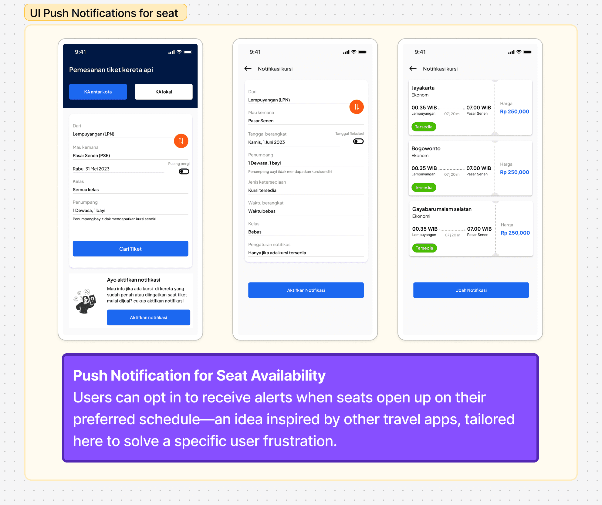
Push Notifications: Notifications to alert users when seats become available or when their temporary reservation is about to expire. This helps them stay informed without constantly checking the app.
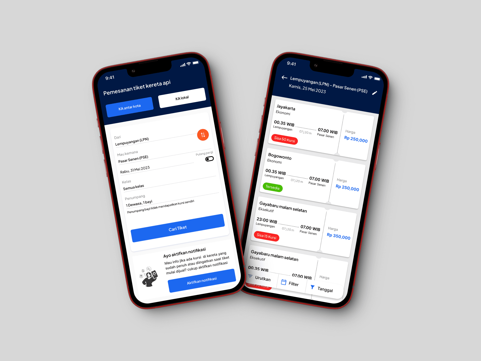
Wireframing
After selecting the features to focus on, I created low-fidelity wireframes to map out the user flow and layout. These wireframes helped visualize how each feature would fit within the existing app structure. Once I validated the wireframes internally,
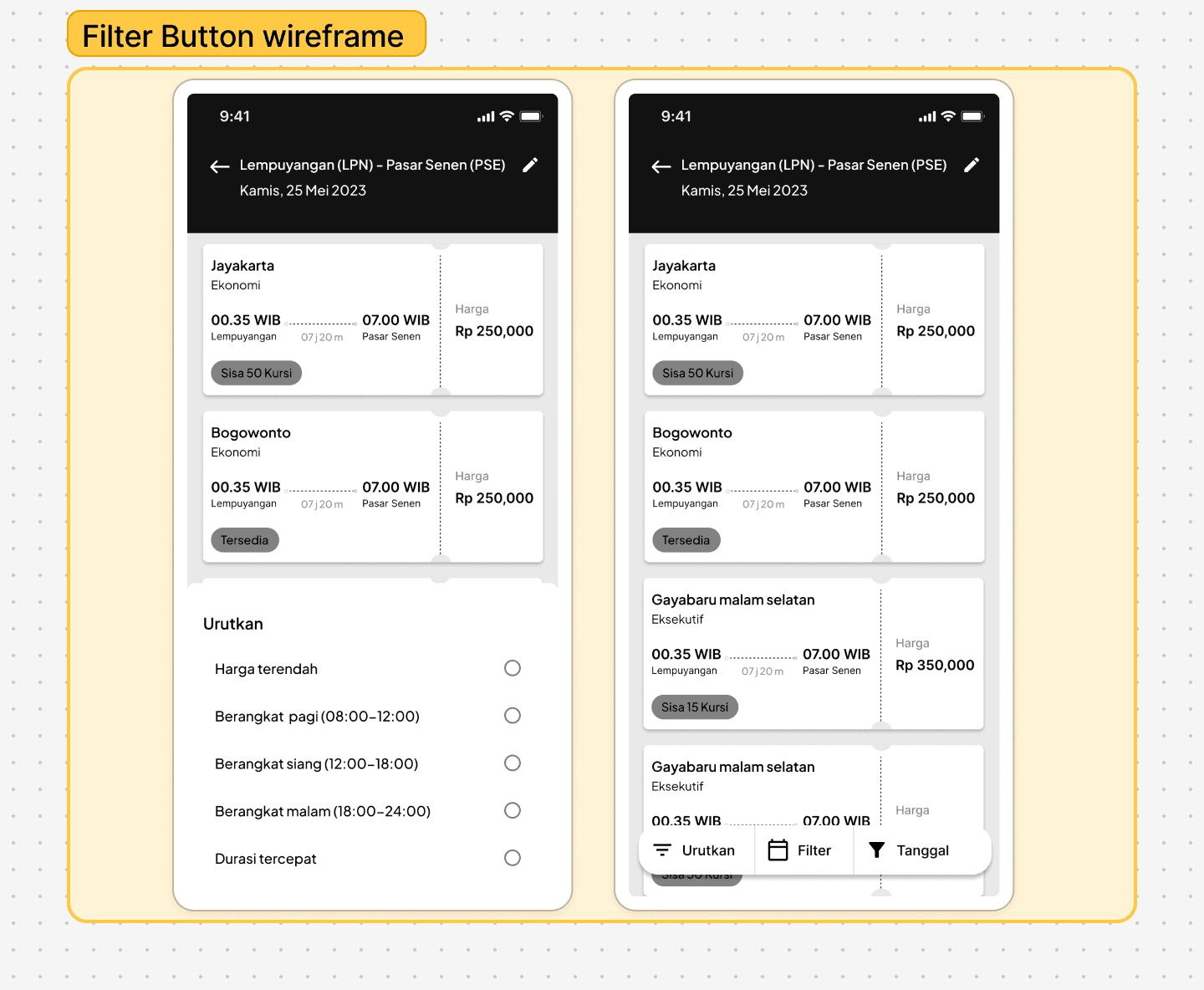
Goals : Speed up the schedule sorting process without sacrificing convenience.
Analysis : Providing a button or shortcut for quick schedule search certainly increases efficiency and reduces time pressure, especially for users who book close to departure time. In other words, it helps them not to feel bogged down in too many options or unnecessary details.

Goals : Helping users feel more at ease and reduce stress when booking tickets.
Analysis :This feature is very effective in reducing the feeling of being rushed. By giving users the opportunity to book seats without an immediate commitment, they can feel more comfortable confirming their choice. This addresses the need for more time to evaluate options.

Goals : Gives a sense of control and more time to decide without rushing.
Analysis :This feature is very useful to remind users about available seats, reducing their anxiety if they don't book right away. This makes the booking process feel more flexible and allows users to feel more confident in their decision.
Goals
From these insights, it became clear that the issue wasn't just about speed—it was about clarity and confidence. Users need to feel in control, not rushed.
Final Outcome
The final design aimed to make the train ticket booking experience feel more relaxed, intuitive, and user-friendly—especially for users who often book close to departure time.
Here are the key features I introduced:

Usability Testing & Insights
After finalizing the UI design, I conducted usability testing with several participants to evaluate whether the proposed features successfully addressed the core issues. Here’s what I found:
Easy-to-Understand Booking Flow
Most participants—whether they were new to booking train tickets online or already familiar with it—found the updated flow intuitive and easy to navigate.Push Notification Awareness Needs Time
A few users didn’t notice the push notification feature at first. While it required a bit of introduction, they later found it useful in keeping track of seat availability and reminders.Temporary Reservation Reduces Stress
The temporary reservation feature was well-received, especially in cases where users experienced payment method issues. It gave them peace of mind knowing they wouldn’t lose their seat while resolving the problem.These findings confirmed that the proposed features had a positive impact on the overall experience, especially in helping users feel more in control during time-limited scenarios.
What I Learned
This design challenge was more than just following a brief—it was also an opportunity to explore how design decisions can better reflect real user behavior.
Although the problem was already defined in the challenge prompt, I decided to validate it with actual users to ensure I was solving the right pain points. This process taught me that design briefs and user research don’t have to be in conflict—they can complement each other. The brief gives direction, while real users bring context and depth.
One key learning was how much user stress is shaped by time pressure. Even simple features like a temporary reservation or push notifications can significantly reduce that pressure and improve the overall experience.
Next Steps / Improvement Ideas
While the outcome addressed the main problems, I believe there’s still room to improve:
Make Push Notifications More Discoverable
I would explore ways to make this feature more visible and intuitive—perhaps through onboarding tips or contextual prompts.Enhance Feedback for Temporary Reservation
Adding a visual timer or confirmation message could help reassure users that their seat is reserved, minimizing uncertainty.Broaden User Testing Pool
Testing with a more diverse group—including users from different age groups or levels of digital literacy—could uncover new insights and edge cases.Balancing Brief vs. Reality
In future challenges, I’ll aim to clearly bridge the gap between brief-defined goals and real-world findings, and call out where they align or diverge in the case study itself.