Crafting the Brand and Landing Page for a New Manufacturing SaaS
Shaping the brand and first landing page for a new Manufacturing SaaS — from naming, story structure, to clean UI for lead generation.
Project Overview
As the only designer in a small team building a complex B2B product, I took part in shaping its early identity from naming to designing its very first landing page.
Context
When our team started developing an all-in-one software platform for manufacturing operations —from order management to warehouse to production one thing became clear: we had no brand, no website, and no marketing team.
This wasn’t just a design task. It was about giving form to something that didn’t exist yet and making it understandable for people outside the team
My Role
I was responsible for:
Exploring and validating product naming
Creating brand direction and tone
Writing and structuring the landing page content
Designing the overall look and feel of the site
Challenge
I don’t come from a branding background, so I leaned on AI tools as creative partners from name generation to messaging ideas and combined those insights with internal discussions to shape something that felt right for our product and market.
Understanding The Problem
We knew we needed a landing page. But what should it actually say? Our goal wasn’t just to look “techy.” We needed to build awareness for the product, speak directly to manufacturers, and generate early leads. That meant:

so the real UX problem is

Design Process
Defining The Brand Foundations
I started by exploring naming options using AI tools and discussing them with the team. We wanted something simple, memorable, and relevant to the manufacturing context — without sounding too “techy” or generic.
Side Note: Letting AI Help Where I Lacked Expertise
I’m not a branding expert, so I used AI tools to help me generate name ideas, value propositions, and even tone suggestions. Rather than relying on intuition alone, I treated AI as a creative collaborator helping me explore faster, validate directions, and make more confident decisions.
It didn’t replace thinking it simply gave me a wider range of perspectives to build from.
For the naming phase, I conducted initial exploration using AI as a sparring partner for ideation. From around 3-5 name options that emerged, I chose one that best aligns with the brand values I want to build: Stechoq Suite. This name was chosen because it represents
Direct connection to corporate identity
Using the name “Stechoq” strengthens the direct association with the parent company, building trust and brand continuity.
The word “Suite” reflects an interconnected, modular system.
“Suite” is commonly used in the software world to describe a collection of integrated applications (e.g., Google Workspace Suite, Adobe Suite). This aligns with our goal: to build an application ecosystem that can be implemented flexibly and incrementally, tailored to the needs of each manufacturing client.
Scalability and communication flexibility
This name can easily be extended to sub-brands or derivative products, for example: Stechoq Suite: Forecasting ,Stechoq Suite: Warehouse, Stechoq Suite: Insight
Professional and enterprise-ready tone
Compared to more descriptive or overly creative names, “Stechoq Suite” conveys a sense of stability, seriousness, and is well-suited to a B2B context.
Structuring the Narrative
Rather than just listing features, I framed the content as a story:
The current challenges faced by factories and manufacturers
How our platform helps solve them
What makes our product different
The goal was clarity over cleverness. I wanted decision-makers (not just tech people) to quickly understand the value.
Personal Note: UX Starts with Story
I learned that shaping the narrative is just as important as shaping the layout. Telling a clear story helped me organize the content and design decisions more intentionally — especially for a product this complex.
Structuring the Story: From Wireframe to Visual Flow
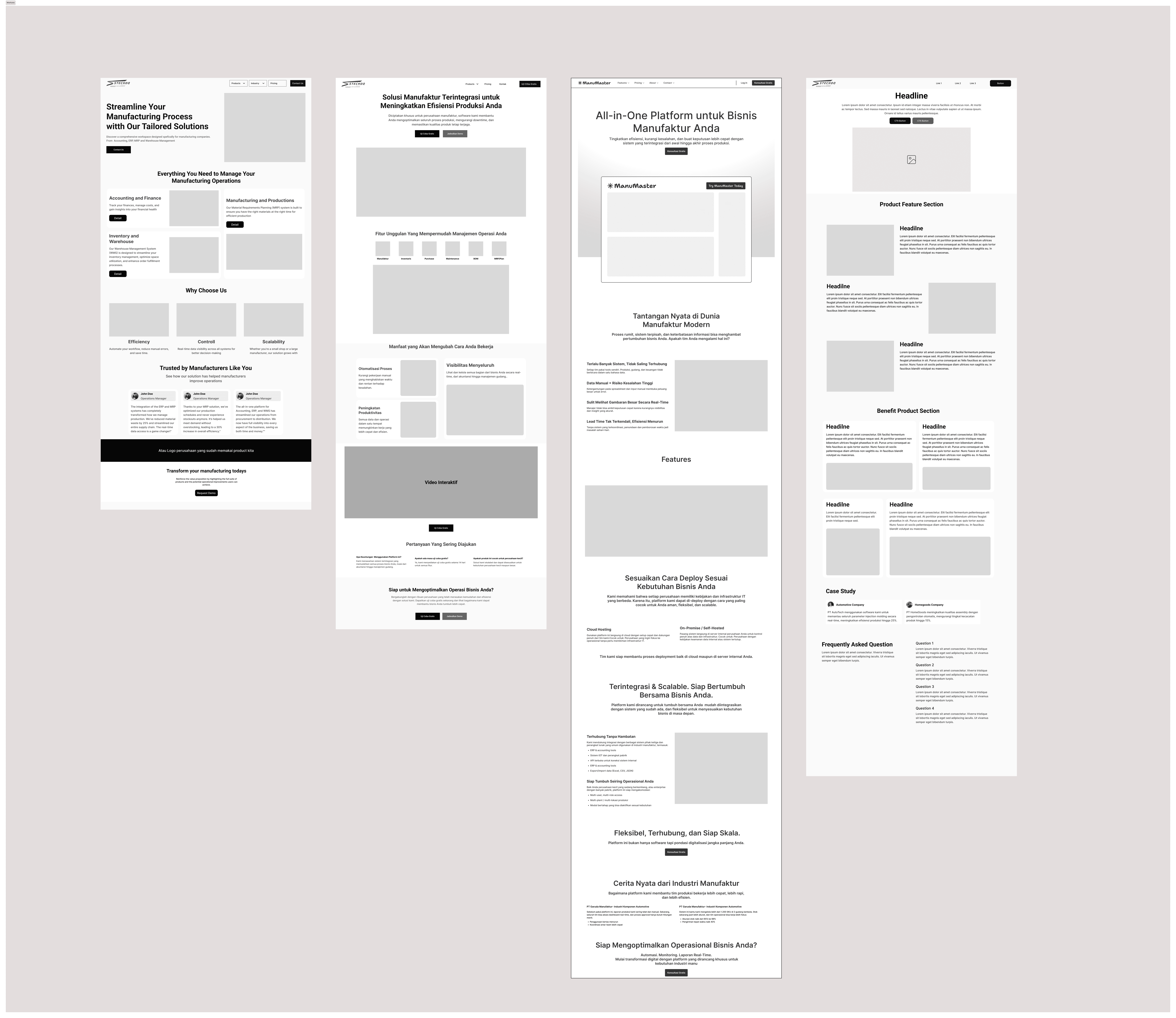
Before jumping into visuals, I worked through several wireframe iterations to explore different content flows.
The initial version was heavy on product features — but it felt cold and lacked emotional hook. I then tested a version that started with customer pain points, which felt more relatable

Designing for Trust and Simplicity
From the start, I knew this landing page had to do two things well: build trust and communicate clearly.
Since this product is targeting B2B manufacturing businesses — many of whom aren't familiar with tech jargon focused on designing with clarity in mind. That meant using simple messaging, structured sections, and visual cues that highlight the product’s real impact.
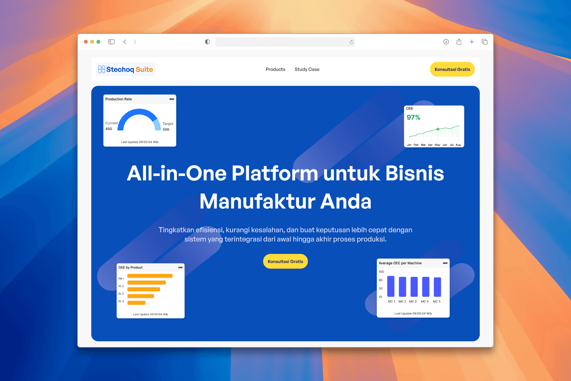
💡 I used soft gradients, pastel-toned 3D isometric illustrations, and visual whitespace to create a layout that feels modern, yet not intimidating.
Rather than overloading users with feature lists, I organized the content like a conversation:
Start with the problem context (too many disconnected systems, manual data, low efficiency).
Then show how the platform solves it through a connected flow (from shop floor to analytics).
And finally, let users imagine how this could work in their own setup — with flexible modules and deployment.
Side Note: This was my first time writing and designing a full landing page solo. I learned that simplicity isn’t easy it takes effort to make something complex feel natural and clear.
Final Design Overview
Here are key sections from the landing page design:


Outcome
While the product is still in development and this landing page isn’t public yet, the internal feedback has been strong.
It’s now being used in stakeholder demos and early conversations with prospective partners helping our team align on product vision and messaging.
Side note: This was also my first experience working on branding. With no team yet, I leaned on AI tools to help me draft early copy and positioning directions, then iterated manually from there. It wasn’t perfect, but it got us moving.
What I Learned
Looking back, this project pushed me to work outside of the UI-only mindset. I had to:
Think like a marketer
Write like a strategist
And design like a translator between tech and business
It taught me that designing a landing page isn’t about making things pretty — it’s about making things understandable and believable.
